This is a collection of Image Frames and various styles that I come across. You can also use these to style modules by simply adding the relevant code and class.
Simple Rounded Images
These images are created by simply using border-radius. 50% and seem to be the max you can apply, after this nothing happens.
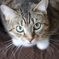
200px x 200px border-radius: 50%
HTML
<img src="/images/kb/2015/621/cat-whiskers-kitty-tabby-200x200.jpg" alt="cat whiskers kitty tabby 200x200" style="border-radius: 50%;" />
This is a square image (200px x 200px) that has rounded corners and with this particular setting the image is a perfect circle.
200px x 200px border-radius: 20%
HTML
<img src="/images/kb/2015/621/cat-whiskers-kitty-tabby-200x200.jpg" alt="cat whiskers kitty tabby 200x200" style="border-radius: 20%;" />
This is a square image (200px x 200px) that has rounded corners.
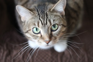
200px x 300px border-radius: 50%
HTML
<img src="/images/kb/2015/621/cat-whiskers-kitty-tabby-300x200.jpg" alt="cat whiskers kitty tabby 300x200" style="border-radius: 50%;" />
This is a rectangle image (300px x 200px) and as you can see the shape is now an oval.
200px x 300px border-radius: 20%
HTML
<img src="/images/kb/2015/621/cat-whiskers-kitty-tabby-300x200.jpg" alt="cat whiskers kitty tabby 300x200" style="border-radius: 50%;" />
This is a rectangle image (300px x 200px) and as you can see the shape is still a rectangle but has rounded corners.
.frame-1 - Grey Border and 3D Shadow
CSS
/* Grey Border and 3D Shadow */
.frame-1 {
    -moz-transition: all 300ms ease-out 0s;
    -moz-border-bottom-colors: none;
    -moz-border-image: none;
    -moz-border-left-colors: none;
    -moz-border-right-colors: none;
    -moz-border-top-colors: none;
    background: -moz-linear-gradient(center top , #FAFAFA, #DDDDDD) repeat scroll 0 0 transparent;
    background: -webkit-gradient(linear, left top, left bottom, color-stop(0%,#FFFFFF), color-stop(99%,#E7E8EB)); /* Chrome,Safari4+ */
    background: -webkit-linear-gradient(top, #FFFFFF 0%,#E7E8EB 99%); /* Chrome10+,Safari5.1+ */
    background: -o-linear-gradient(top, #FFFFFF 0%,#E7E8EB 99%); /* Opera11.10+ */
    background: -ms-linear-gradient(top, #FFFFFF 0%,#E7E8EB 99%); /* IE10+ */
    filter: progid:DXImageTransform.Microsoft.gradient( startColorstr='#FFFFFF', endColorstr='#E7E8EB',GradientType=0 ); /* IE6-9 */
    border-color: #C9CBCD;
    border-radius: 0px;
    border-style: solid;
    border-width: 1px 1px 2px;
    -webkit-box-shadow: 0 8px 6px -6px black;
    -moz-box-shadow: 0 8px 6px -6px black;
    box-shadow: 0 8px 6px -6px black;
    display: inline-block;
    outline: medium none;
    padding: 4px;
}
.frame-1a - Double Grey Border and 3D Shadow
CSS
/* Double Grey Border and 3D Shadow */
.frame-1a {
    -moz-border-bottom-colors: none;
    -moz-border-left-colors: none;
    -moz-border-right-colors: none;
    -moz-border-top-colors: none;
    background: transparent -moz-linear-gradient(center top , #fafafa, #dddddd) repeat scroll 0 0;
    border-color: #c9cbcd;
    border-image: none;
    border-radius: 0;
    border-style: solid;
    border-width: 1px 1px 2px;
    box-shadow: 0 8px 6px -6px black;
    display: inline-block;
    outline: medium none;
    padding: 4px;
    transition: all 300ms ease-out 0s;
}
This is a simple grey image frame with a bit of a 3D effect
Double .frame-1a - Polaroid Style
A nice polaroid style, great for modules
HTML
<p class"frame-1a">.
<img src="/images/kb/2015/621/cat-whiskers-kitty-tabby-300x200.jpg" alt="cat whiskers kitty tabby 300x200" class="frame-1a" />
<br /> A nice polaroid style, great for modules</p>
<p>This is a nice effect of layering the image frames for a module or image.</p>
This is a nice effect of layering the image frames for a module or image. As you can see in the code the image and it's parent container has the .frame-1a class applied. This can be translated easily into a module by putting the class in to the modules class suffix and either a manully created container in the module or on an image. You can also mix and match other template classes with the method to see what you get.
.frame-2 - Black Border and 3D Shadow
CSS
/* Black Border and 3D Shadow */
.frame-2 {
    -moz-border-bottom-colors: none;
    -moz-border-image: none;
    -moz-border-left-colors: none;
    -moz-border-right-colors: none;
    -moz-border-top-colors: none;
    background: -moz-linear-gradient(center top , #201b1a, #141111) repeat scroll 0 0 transparent;
    background: -webkit-gradient(linear, left top, left bottom, color-stop(0%,#666), color-stop(99%,#444)); /* Chrome,Safari4+ */
    background: -webkit-linear-gradient(top, #666 0%,#444 99%); /* Chrome10+,Safari5.1+ */
    background: -o-linear-gradient(top, #666 0%,#444 99%); /* Opera11.10+ */
    background: -ms-linear-gradient(top, #666 0%,#444 99%); /* IE10+ */
    filter: progid:DXImageTransform.Microsoft.gradient( startColorstr='#666', endColorstr='#444',GradientType=0 ); /* IE6-9 */
    border-color: #555;
    border-radius: 0px;
    border-style: solid;
    border-width: 1px 1px 2px;
    -webkit-box-shadow: 0 8px 6px -6px black;
    -moz-box-shadow: 0 8px 6px -6px black;
    box-shadow: 0 8px 6px -6px black;
    display: inline-block;
    outline: medium none;
    padding: 4px;
}
.circle-1 - Round Images with Double Grey Border (with horizontally stretch if needed)
CSS
/* Round Images with Double Grey Border (with horizontally stretch if needed) */
.circle-1 {
    -moz-transition: all 300ms ease-out 0s;
    -moz-border-bottom-colors: none;
    -moz-border-image: none;
    -moz-border-left-colors: none;
    -moz-border-right-colors: none;
    -moz-border-top-colors: none;
    background: -moz-linear-gradient(center top , #FFFFFF, #E7E8EB) repeat scroll 0 0 transparent;
    background: -webkit-gradient(linear, left top, left bottom, color-stop(0%,#FFFFFF), color-stop(99%,#E7E8EB)); /* Chrome,Safari4+ */
    background: -webkit-linear-gradient(top, #FFFFFF 0%,#E7E8EB 99%); /* Chrome10+,Safari5.1+ */
    background: -o-linear-gradient(top, #FFFFFF 0%,#E7E8EB 99%); /* Opera11.10+ */
    background: -ms-linear-gradient(top, #FFFFFF 0%,#E7E8EB 99%); /* IE10+ */
    filter: progid:DXImageTransform.Microsoft.gradient( startColorstr='#FFFFFF', endColorstr='#E7E8EB',GradientType=0 ); /* IE6-9 */
    border-color: #C9CBCD;
    border-radius: 800px;
    border-style: solid;
    border-width: 1px 1px 2px;
    display: inline-block;
    outline: medium none;
    padding: 8px;
}
.circle-1a - Round Images with Double Grey Border (with horizontally stretch if needed)
CSS
/* Round Images with Double Grey Border (with horizontally stretch if needed) */
.circle-1a {
    -moz-border-bottom-colors: none;
    -moz-border-left-colors: none;
    -moz-border-right-colors: none;
    -moz-border-top-colors: none;
    background: transparent -moz-linear-gradient(center top , #ffffff, #e7e8eb) repeat scroll 0 0;
    border-color: #c9cbcd;
    border-image: none;
    border-radius: 800px;
    border-style: solid;
    border-width: 1px 1px 2px;
    display: inline-block;
    outline: medium none;
    padding: 8px;
    transition: all 300ms ease-out 0s;
}
There might be no difference between .circle-1 and circle-1a .
Simple Image Gallery Polaroid Code
I have put this here for when I do my own Polaroid Frame Article, either here or possible a separate article.
CSS
/**
 * @version		3.0.x
 * @package		Simple Image Gallery Pro
 * @author		JoomlaWorks - http://www.joomlaworks.net
 * @copyright	Copyright (c) 2006 - 2014 JoomlaWorks Ltd. All rights reserved.
 * @license		http://www.joomlaworks.net/license
 */

/* --- Generic Styling --- */
a:active,a:focus { outline:0; }
table.contentpaneopen { width:100%; }
li.sigProClear { clear:both; float:none!important; height:0!important; line-height:0!important; border:none!important; background:none!important; width:auto; margin:0!important; padding:0!important; }

/* Container */
ul.sigProPolaroids { margin:20px!important; padding:40px 60px!important; list-style:none; clear:both; overflow:hidden; }
	ul.sigProPolaroids.singleThumbGallery { margin:0!important; padding:8px 36px 8px 16px!important; list-style:none!important; float:left; }

/* Thumbnail: use e.g. width:33%; to force 3 columns */
ul.sigProPolaroids li.sigProThumb { display:block; float:left; background:#fff!important; list-style:none!important; margin:20px 0 27px 30px; padding:10px; text-align:center; text-decoration:none; color:#333; font-family:'Indie Flower', cursive; font-size:18px;
    -moz-box-shadow: 0px 3px 6px rgba(0,0,0,.25);
 -webkit-box-shadow: 0px 3px 6px rgba(0,0,0,.25);
         box-shadow: 0px 3px 6px rgba(0,0,0,.25);

    -moz-transition: 0 0.15s linear;
      -o-transition: 0 0.15s linear;
 -webkit-transition: 0 0.15s linear;
     -ms-transition: 0 0.15s linear;
         transition: 0 0.15s linear;

		 -moz-transform: rotate(-2deg);
       -o-transform: rotate(-2deg);
  -webkit-transform: rotate(-2deg);
      -ms-transform: rotate(-2deg);
          transform: rotate(-2deg);
             filter: progid:DXImageTransform.Microsoft.Matrix(M11=0.9993908270190958, M12=0.03489949670250097, M21=-0.03489949670250097, M22=0.9993908270190958, sizingMethod='auto expand');
               zoom: 1;
}
ul.sigProPolaroids li.sigProThumb:nth-child(even) {
     -moz-transform: rotate(2deg);
       -o-transform: rotate(2deg);
  -webkit-transform: rotate(2deg);
      -ms-transform: rotate(2deg);
          transform: rotate(2deg);
             filter: progid:DXImageTransform.Microsoft.Matrix(M11=0.9993908270190958, M12=-0.03489949670250097, M21=0.03489949670250097, M22=0.9993908270190958, sizingMethod='auto expand');
               zoom: 1;

}
ul.sigProPolaroids li.sigProThumb:nth-child(3n) { position:relative; top:-5px;
     -moz-transform: rotate(0deg);
       -o-transform: rotate(0deg);
  -webkit-transform: rotate(0deg);
      -ms-transform: rotate(0deg);
          transform: rotate(0deg);
             filter: progid:DXImageTransform.Microsoft.Matrix(M11=1, M12=0, M21=0, M22=1, sizingMethod='auto expand');
               zoom: 1;
}
ul.sigProPolaroids li.sigProThumb:nth-child(5n) { position:relative; right:5px;
     -moz-transform: rotate(5deg);
       -o-transform: rotate(5deg);
  -webkit-transform: rotate(5deg);
      -ms-transform: rotate(5deg);
          transform: rotate(5deg);
             filter: progid:DXImageTransform.Microsoft.Matrix(M11=0.9961946980917455, M12=-0.08715574274765817, M21=0.08715574274765817, M22=0.9961946980917455, sizingMethod='auto expand');
               zoom: 1;
}
ul.sigProPolaroids li.sigProThumb:nth-child(8n) { position:relative; right:5px; top:8px; }
ul.sigProPolaroids li.sigProThumb:nth-child(11n) { position:relative; left:-5px; top:3px; }

ul.sigProPolaroids li.sigProThumb:hover { position:relative;
 -webkit-transform:scale(1.2);
    -moz-transform:scale(1.2);
      -o-transform:scale(1.2);

   -moz-box-shadow: 0px 3px 6px rgba(0,0,0,.5);
-webkit-box-shadow: 0px 3px 6px rgba(0,0,0,.5);
        box-shadow: 0px 3px 6px rgba(0,0,0,.5);
}

ul.sigProPolaroids li.sigProThumb a.sigProLink { color:#333; text-decoration:none; overflow:hidden; }
ul.sigProPolaroids li.sigProThumb a.sigProLink img.sigProImg { display:block; width:100%; margin-bottom:8px; background-repeat:no-repeat; background-position:50% 50%;}

/* Caption */
ul.sigProPolaroids span.sigProPseudoCaption,ul.sigProPolaroids span.sigProCaption { display:block; text-align:center; font-family:'Indie Flower', cursive; font-size:22px; font-weight:bold; }

/* Popup */
span.sigProPopupCaption { font-weight:bold; color:#C63C13; font-size:13px; font-family:Georgia, "Times New Roman", Times, serif; }
a.sigProDownloadLink,
a.sigProDownloadLink:hover { background:url(../images/disk.png) no-repeat left center; padding:4px 0 4px 20px; }
div.sigProModulePosition { text-align:center; border-top:1px solid #ccc; border-bottom:1px solid #ccc; padding:4px; margin:8px 0; background:#ffffdd; }

/* IE specific styling: Use "body.sigProIsIEX element {}" - where X is 6, 7 or 8 - to target elements for these browser versions only */
body.sigProIsIE6 ul.sigProPolaroids li.sigProThumb,
body.sigProIsIE7 ul.sigProPolaroids li.sigProThumb,
body.sigProIsIE8 ul.sigProPolaroids li.sigProThumb {border:1px solid #ccc;border-right:2px solid #ccc;border-bottom:2px solid #ccc;}
body.sigProIsIE6 ul.sigProPolaroids li.sigProThumb span.sigProCaption,
body.sigProIsIE7 ul.sigProPolaroids li.sigProThumb span.sigProCaption,
body.sigProIsIE8 ul.sigProPolaroids li.sigProThumb span.sigProCaption {}
body.sigProIsIE7 ul.sigProPolaroids li.sigProThumb {float:none;display:inline;}
body.sigProIsIE6 ul.sigProPolaroids li.sigProThumb a.sigProLink:hover,
body.sigProIsIE7 ul.sigProPolaroids li.sigProThumb a.sigProLink:hover,
body.sigProIsIE8 ul.sigProPolaroids li.sigProThumb a.sigProLink:hover {color:#125BAE;}
body.sigProIsIE6 ul.sigProPolaroids li.sigProThumb a.sigProLink img.sigProImg,
body.sigProIsIE7 ul.sigProPolaroids li.sigProThumb a.sigProLink img.sigProImg {width:auto;}

/* Flickr Set link */
a.sigProFlickrSetLink {display:block;clear:left;padding:2px 8px;font-size:10px;text-align:center;}

/* Print message */
.sigProPrintMessage {display:none;}